As a visuals geek, I have been delighted with the symbolic language that they have been employing in Limitless. So naturally when I heard they were going to give us an episode from Rebecca’s point of view, I was hugely interested to see if they would take the look in a different direction given a different characters point of view. Â We’ve already had different characters on NZT (Piper, Casey, Morro) but the story has still stayed true to Brian being the primary character and hence, it’s to be expected that we continue with his bright worldview and artsy-craftsy problem solving techniques. Â In the case of this weeks episode, we are inside Rebecca’s head, which should (I expected) give us a dramatically different outlook on the world.
The look and feel was much subtler than I expected.  With Brian as the POV character, the difference is brighter, the character almost glows during those first few seconds of camera-shift.  We get a similar shift in Rebecca’s case, but it is nowhere near as dramatic (befitting her character’s personality).  I’m not yet sure if that is some kind of foreshadowing but I suspect the next episode will answer this for us.
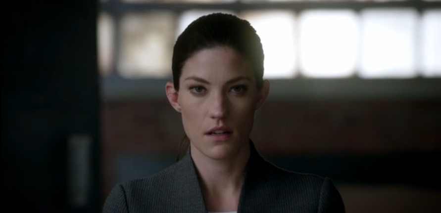
Rebecca before NZT
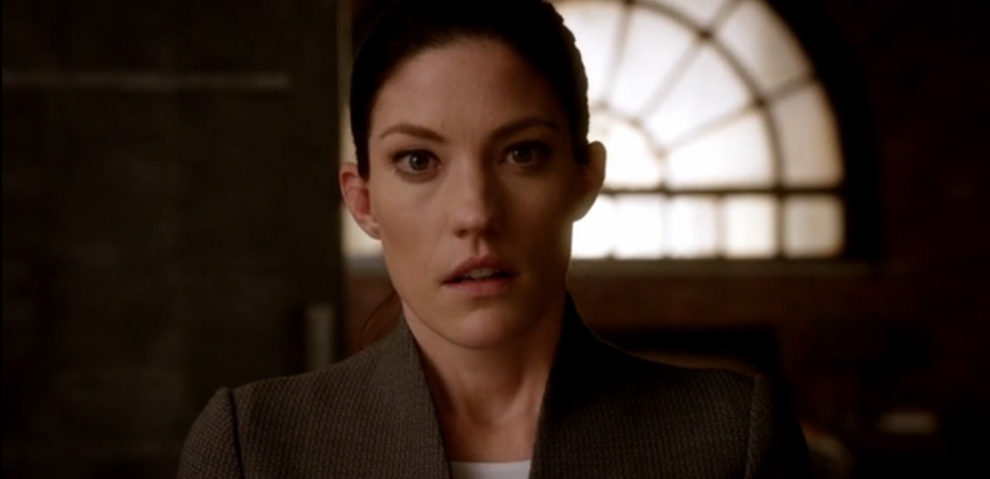
Rebecca after NZT
See the color shift? Â Everything develops a warmer, orangish tint (it’s particularly noticeable around the whites of the eyes). Â This color change sticks (in both Brian’s cases and in Rebecca’s solitary case) thru the entire episode.
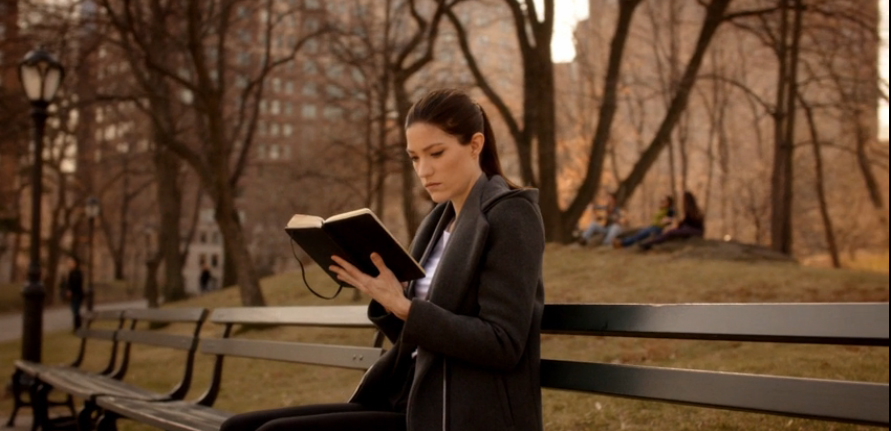
The biggest difference between the two characters (which suits them quite nicely, by the way) is that, while Brian’s thought processes and illustrations are on the wildly creative side of things (puppets, houses made of sticks, crayon drawings), Rebecca has fixated on the linear h*ll that is… Â The Etch-O-Sketch.
(Please note, I loved my Etch-o-Sketch as a kid, but I had one of those parents who interrupted me every half hour or so because PARENTING, so my experiences with it always came up wanting).
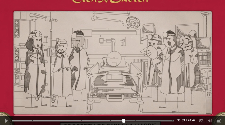
Rebecca’s NZT Etch-a-sketch. Â Lady gotz skillz
And the thing about the EaS (because I’m tired of writing “Etch-a-Sketch” over and over) is that to work with one, to really get a proper result like the one you see here, takes forethought, it takes planning. Â You can’t erase, not one single line. Â This is a linear progression and one that requires a complete and total do-over if you muck it up (or some extra creativity to recover).
One of the reasons all of this is so much fun is that, when Rebecca is not on NZT and Brian *is*, she’s very nearly a match for him. Â Brian gets all the obscure stuff, what color a high C-note smells like and other bits that are beyond the norm, but when it comes to the actual case-solving, Rebecca is on a par, sometimes even one step ahead. Â So seeing that character outclass Brain when they *both* are on NTZ is something to behold, and the people behind the look and feel of the show are supporting that by carrying over the same visual language normally used in Brian as the main POV character.