I’ve talked about the “fragmentation“ problem in cinematic design before on this blog. The fact that, in pursuit of ever more fantastic environments we have begun pushing levels of irrelevant detail in television and film, to the point where the ability of the viewer to follow the action in the scene becomes compromised.
In the above image we have a fantastically detailed costume and an equally fantastically detailed environment with thousands of digital actors providing a sea of visual noise. It would be very easy for Kunis to get lost in a shot like this. However, throughout the scene we can clearly see her resolved against that background. Part of this success is due their use of depth of field; everything beyond Kunis (no matter how pretty) has been blurred out. We get an impression of the presence of that detail without needing to waste time and brain-power on trying to “see” it. The other factor here is that Kunis’ dress is entirely in the “cool red” spectrum of color, even the whites are tinted cool pink, which sets her apart from the “warm” colors used in the rest of the environment (as we know, setting a cool color in a warm background gives a similar, but subtler effect to using colors opposite on the color wheel, blue versus yellow, for example).
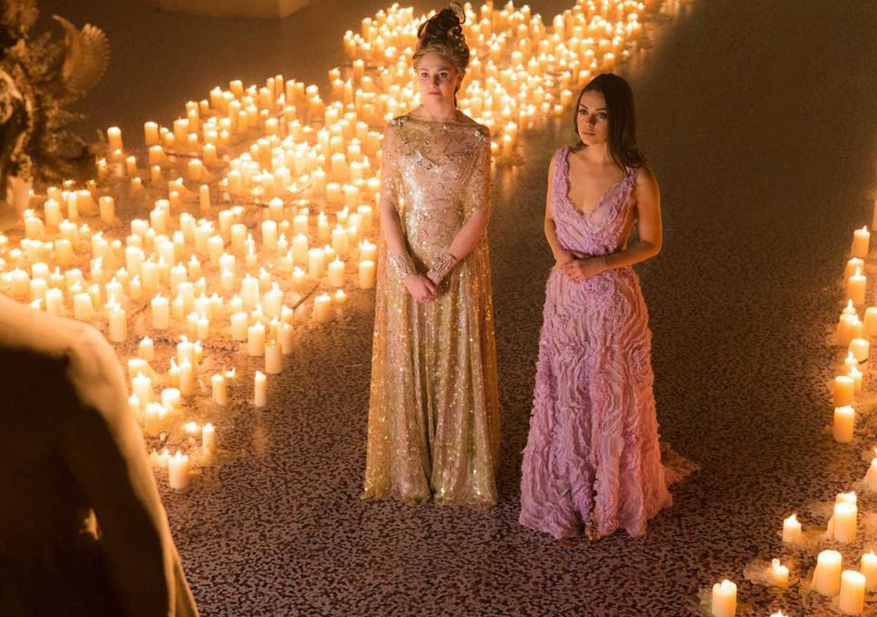
In the image above, we again have a sea of texture in the pattern in the floor and the candles that line the walk. Stack on top of that, the complex patterning of the character’s costumes and you have the potential for a visual mess. If you half-close your eyes, you can see it all rather blur together, BUT again we have the forethought of the visual design team to thank. Kunis is the one receiving the revelations of her history here, so her reactions are the single most important thing is this scene. To that end, they have again placed her in “cool reds” against a warmer, yellower background so that she is easy to track. In comparison the yellow dress and the complicated hair detail on Middleton make her almost a part of the scenery, whereas Kunis face and hair are unadorned and the play of light skin and dark hair gives us the greatest point of contrast (thereby directing the eyes right to her face).
Love it, or hate it, Jupiter Ascending is a master class in the art of directing the eye in modern VFX design. The environments are so richly detailed that it would be easy for the cinematographer, director and set designers to go at cross-purposes and end up with, essentially, a hot visual mess. But, through careful application of depth of field and use of light and color, the filmmakers have avoided one of the most common problems in special-effects spectaculars.
In this film, no piece of art is so sacred that it cannot be blurred or otherwise subverted in-service of the greater visual narrative. Even in the busiest scenes with vast cities in the background or thousands of digitally inserted characters in the wedding hall, when combined with the strength of the art direction and visual design, this film is a textbook example of how to “do it right“ in an era when “more” is almost always the order of the day.